Directional Signage (also known as “way finding”) can be the kind of project with the least possible return on the highest possible investment. (It’s okay, I’m not talking about funny church signs. That is the gift that just keeps on giving.)
Signage is expensive, takes time and once installed you will forget about it. However, signs are a very important link in the process to help people get to where they need to go with ease in a church.
Below are some of the thoughts and lessons that I have learnt along the way in this project.
1. Look around and ‘borrow’
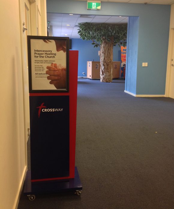
I’m always open to seeing how other churches and organisations do what they do and that includes signage. I love my iPhone and regularly take a picture of something I like in case it is an approach that is right for us down the track. It was so in the case of our portable interior signs (see the picture below). Another church had done something similar and it looked really good. Perfect for a multi-use site.
2. Interact 360 degrees with all your stakeholders
Ensure everybody knows what is going on and where the project is at, and how much it will cost.
3. Plan ahead
Work out your timeline and include plenty of contingency in it. Our project was on a timeline, then got accelerated, then slowed for different good reasons. But you will always need to factor in permits for exterior signs, electrical work and production time. Talk to your suppliers, they should be able to help you.
4. Talk a lot with the experts
I learnt so much from bouncing the ideas off the experts who had done it so many times. They really helped the project run smoothly and introduced the idea of using focus groups. You can read more about that here.
5. Success comes from team, not flying solo
So many people made this project a success, including the finance team, facilities teams, external signage team, my communications team and broader church staff. All added value and gave us the outcome we needed.
6. Check, again and again
I can’t tell you how many times we checked spelling, meaning of words, arrow directions, but even in the installation tweaks were done to ensure the clarity of choice for the user experience.
(If you want to know the 8 steps it took to do this check out my guest post on the Church Marketing Sucks blog).
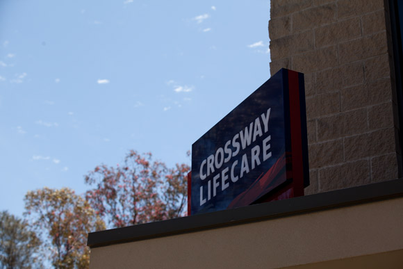
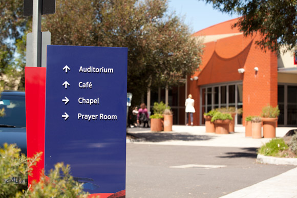
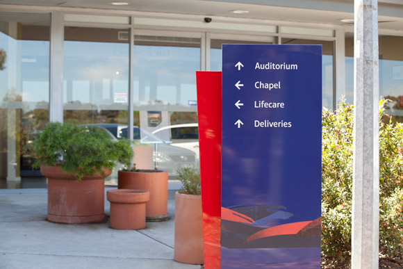
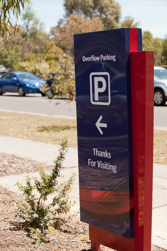
Here is the result of this 2 year project.
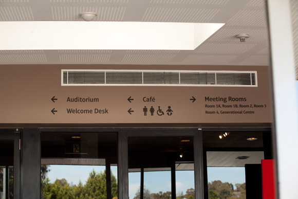
Interior directional signage examples
Above: You can also see our welcome desk which was another recent project.
Below: Portable interior directional signage – handy for events in rooms or fillers with announcements.
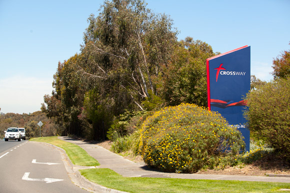
Exterior signs
The bush needs now clipping!
Have you ever done signage for your church? Comment below and leave some ideas, tips or examples.

