Easter is a great time to be inspired by the creativity coming from other churches. As I look online and see what other churches around the world are creating on their websites to promote their Easter services I’m amazed at the talent out there. I love the strategy, creativity and work that communication peeps, designers, videographers put into crafting a great online experience for Easter.
I’d love to hear from you as you review and enjoy the branding on these church websites. Please drop a comment below and share this post with your tribe.
Chapel Church
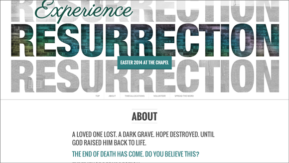
Nice use of parallax scrolling by the team at Chapel.
Fellowship Church
Hillsong
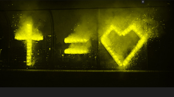
Love the simplicity of the idea. Urban. Memorable. Campaignable. Yes, in advertising parlance, the symbolic approach of cross equals love has limitless extension to it which will extend the life for some time. Just look at last years treatment here.
Mariners Church
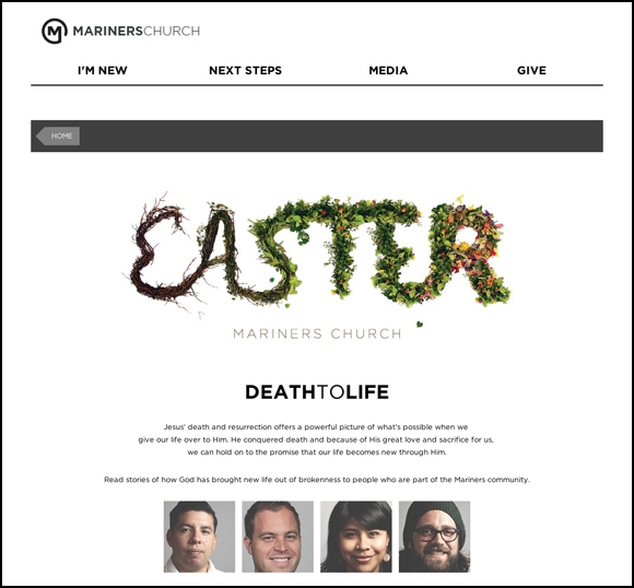
The branding around Mariners Church’s Easter experience captures the death to life theme of their services in such an original way. While the wrap around the branding is the site-wide template this gets in the list because I think the branding itself is exceptional. It could have easily looked weak and flowery, but it is vibrant and stylishly executed design.
Mars Hill Church
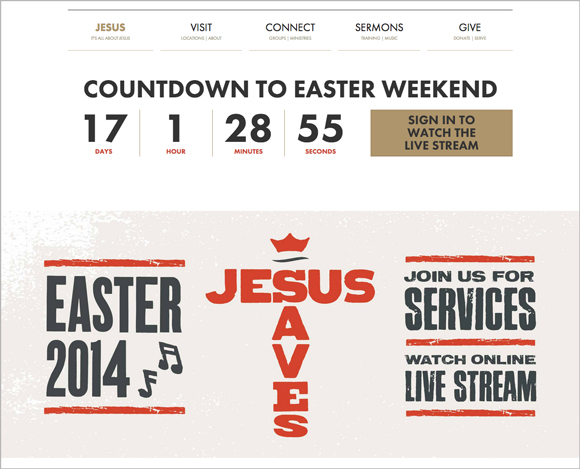
Mars Hill Church have kept a similar design theme for the last few years now. A strong, classic, with a pinch of hipster, typographic approach. What I love about this site isn’t so much the design, although its good. I love the fact that you immediately have an action point – watch online. That is very cool. Very smart. One of my big predictions is that you will see this become commonplace over the next 5-10 years as churches wake up to the fact that behind every click is a person that needs Jesus. The unique visitor isn’t just a statistic. But a person.
NewSpring Church
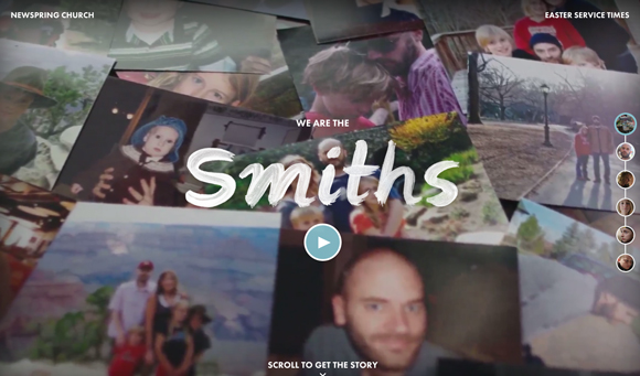
This site is amazing. The storytelling is so real and grounded. The video trailer draws you in wanting to know more. If I was the hugging kind I would want to hug this team and say top work. I’m gushing right now so I’d better stop.
Saddleback
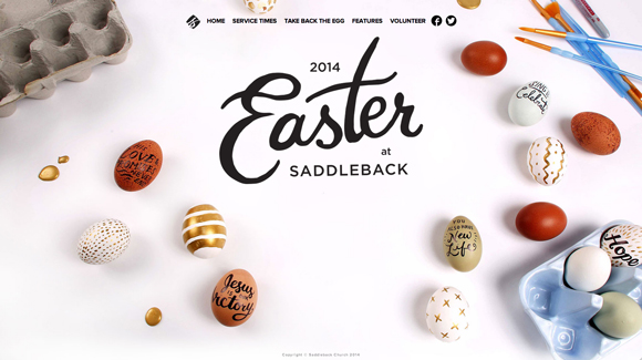
Using a cultural icon like the Easter Egg and redeeming it is such a great idea. Fresh, positive and simple feel. I love the font for the word Easter, really nice choice aesthetically. If you are from an Orthodox background the whole painted egg tradition actually forms part of the Easter celebration. They have also created a Easter Egg hunt where you search through the site to find 33 hidden eggs. You could win a prize for finding all 33! Awesome idea!
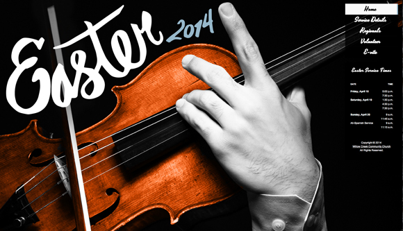
Willow Creek Community Church
Willow Creek’s micro-site is very interesting and different. They choice to lead with a classical music feel certainly makes a strong statement audience wise. As you click-through you discover the classical musical theme continues throughout. (Update just prior to posting: They’ve changed the hero image so have a look!)
I haven’t added ours, but I’m really proud and pleased with the branding effort my team have done to create our Easter 2014 splash page. Check it out.
Your turn
These are just my own favourite church websites from this Easter, what are your favourites? (Check out 12 great examples from last year here) I’m desperate to find a British church website that has a major emphasis branding wise on Easter. Drop a comment or a link below and share the love!

