I love surfing the web for the best church website designs at Christmas. Here are ten websites that I hope will show you what is possible for your own church website for next Christmas. Some are responsive websites, some aren’t. I love the effort that has been put into these sites.
This is just a list of what I think are some of the best church websites this Christmas with a few comments about what I particularly like about them. If you click on any of the pictures they will take to the site so you can see for yourself. But be quick as many churches hide the page once the service has happened.
Finally…. drum roll please…. Trumpets, trumpeting… Here are ten of the best church website designs this Christmas (please drop a comment below if you see something you like, or have seen another website you like):
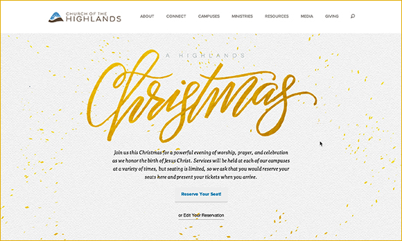
Church Of The Highlands
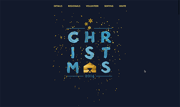
I really admire the typography on this page. Overall it is understated and uses the negative space really well. I’m not sure if the word Christmas was hand-drawn of is a font, but it looks lovely and works really well.
Church On The Move
This is a beautifully executed design. I don’t know if the illustration of the train was commissioned especially for this but it is sumptuous and really gives you the feel of the season and the feel of the experience.
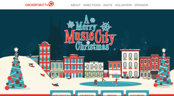
Crosspoint Church
A very different style compared to the rest of the Christmas designs. Yet this flat illustration style works really well. As you scroll down the page they demonstrate that they have really thought through the content design really well.
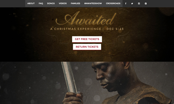
Crossroads Church
The colour grading of the images here is superb and a real reminder of how you can set the tone through the use of colour alone. The photography is really well thought out and really lifts the design to a high level.
Crossway Church
Simplicity around reinforcing the branding was the design goal for our Christmas presentation this year. The page is also fully responsive design that include booking to a reserved ticketing system.
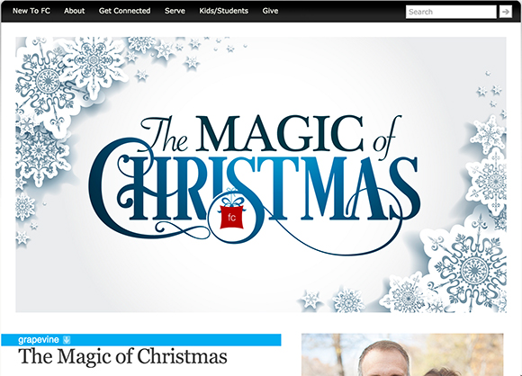
Fellowship Church
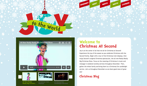
A traditional Christmas branding concept that again uses space really well around the headline. I really like the paper style snow flakes.
Hillsong Church
Hillsong have an Advent campaign going on which is a great idea. It gives you a reason to go back to the website every day. I love the contemporary feel of their Christmas pages.
Saddleback Church
Simple yet so powerful. A lovely typographical piece of branding that uses Isaiah 9:6 as it’s inspiration. ‘For to us a child is born, to us a son is given, and the government will be on his shoulders. And he will be called Wonderful Counselor, Mighty God, Everlasting Father, Prince of Peace.
At the time of posting more features were to be added such as a shareable content and a story page.
Second Baptist Church
I like the colour palette on this design. The branding is very effective and reinforces the name quite nicely.
Willow Creek Church
So simple, yet so strong. The colours and the snowflakes that almost double as stars. Lovely work.
Your turn
I scan church websites for all through December to build this list, however I know I can’t be everywhere. If you think you see a church website has the Christmas design chops then drop a link below.


