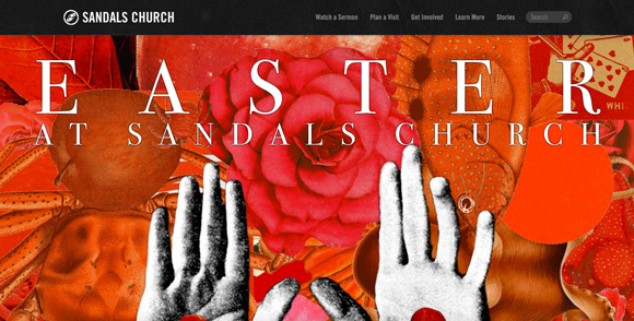
Each Easter I take a look around to review what different churches are doing to promote their Easter services on their website. Churches have had to work fast and really hard to create some lovely sites because Easter is very early this year.
I personally look at websites from a few perspectives:
1. Design approach. There are so many different ways to creatively express what Easter represents.
2. Information dissemination and communication style.
3. Audience focus. Who is their primary audience and how are they communicating with them.
Ready for this year? Let’s have a look.
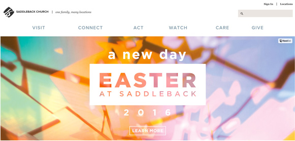
1. Saddleback
2. Crosspoint
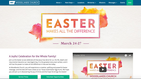
3. Woodlands Church
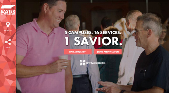
4. Brentwood Baptist
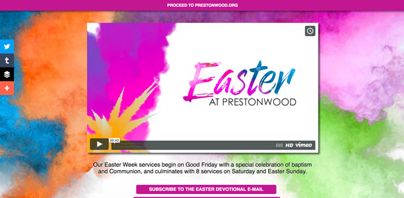
5. Prestonwood
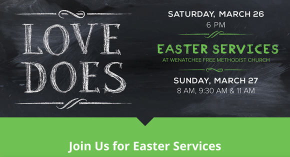
6. Wenatchee
7. Church On The Move
8. Hillsong
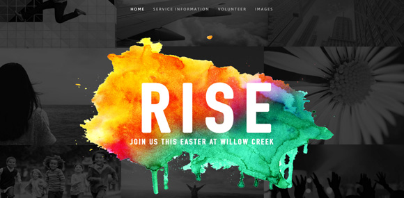
9. Willow Creek
10. Two Rivers Church
11. Sandals Church
Want more? Check out previous year’s below. You never know you may find an idea to inspire you for next year. There are thirty-three beautiful sites in total.
• 2013: Twelve great examples.
Your Turn
I know I’ve only scratched the surface and there are many more websites out there to look at. Have you created one? Have you seen any? What ingredients do you think make for a good website at Easter? Leave a comment below.

