I’m currently doing research for updating the Crossway church website for both desktop and mobile (It feels like ages since I last wrote about mobile phones and their stunning rise in popularity.)
#1 Mobile will become No.1 for internet access
The stats are predicting that mobile internet usage is due to overtake desktop usage in 2014. Smart phones are breeding like rabbits ;-).
#2 Mobile is for outsiders. App’s are for insiders
When was the last time you visited a shop or department store online? I bet that you experienced either their desktop internet or their mobile site. I don’t think people encounter any organisations with such purpose that they will download the organisation’s app first. App’s are for insiders. They are much more likely to enter key words into a search engine. People that are familiar with the brand or organisation are far more likely to engage with an app once they know one is available.
#3 A 1st time visitor will define your church by their mobile search experience
Imagine the conversation at a workplace where someone invites their friend to church. They will probably check the church out to see what its like on their phone. Mobile web will become the number one way people experience your church for the first time. Are you happy with how your church is represented on a smartphone?
Here are some of the mobile sites I like that I’ve seen on my smartphone:
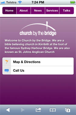
Church By The Bridge
LOVE the fact you can call from the landing page. This is the only church mobile website that has the phone number as a one click feature.
Navigation is above the fold.
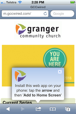
Granger Community Church
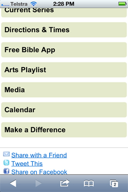
I like the ‘add to home screen’ pop-up function on GCC’s homescreen. Most of the navigation is below the fold.
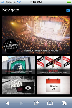
Hillsong London
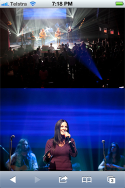
Lot’s of photos to show someone what they could expect.
Brand positioning reflects Hillsong perfectly
The drop down “navigate” menu is really nice. No phone number that I could see which would be frustrating if I’m wanting to check them out then call them from my phone.
The text on the smaller pictures is hard to see which is problematic as they are meant to be clicked through and are supposed to be the main focus.
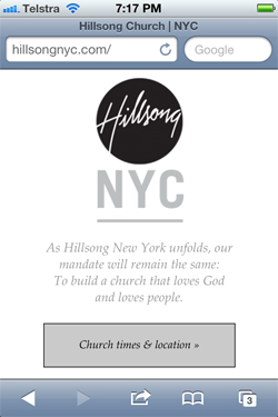
Hillsong New York City
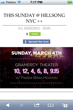
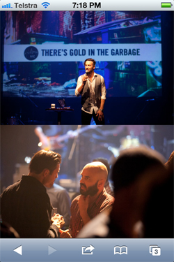
Reflects the photographic storytelling from their blog style desktop website. You do have to scroll down quite a bit to get where you are going to though for different dates. But the photography is brilliant. Brand consistency if there. It is intriguing that Hillsong London and NYC have a mobile site each which are different in navigation focus. Another note is that Hillsong Sydney doesn’t have a mobile site which is surprising.
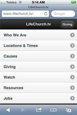
LifeChurch.tv
Very functional, no branding which is intriguing.
All of the menu is above the fold which is good.
I’m not sure about having the giving button as a separate button at the top. It gives prominence to that as focus above who they are which sends the wrong message for me.
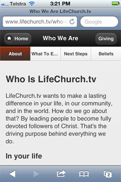
What I LOVE is the navigation once you drill down to the second level. The navigation just reappears once you scroll down the page. That is smart thinking.
It’s content heavy and looks like it pull’s in the content from their desktop site which is a lot of content on a mobile phone.
Long Hollow Baptist Church
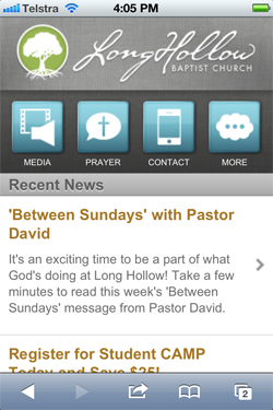
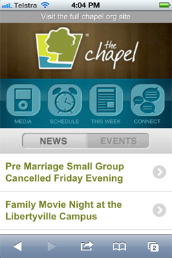
The team that put Long Hollow and The Chapel together were way ahead of the game a few years ago when they first launched their mobile sites. Their sites have stood up well in terms of functionality. The look and feel current and not out of place considering icon styles tend to date reasonably quickly. They’ve done a great job.
Mars Hill Church
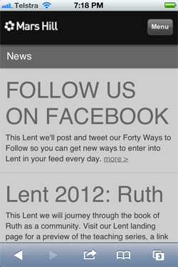
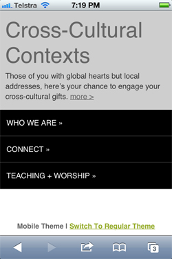
The branding feels consistent, although the site feels a bit plain without any photos on the landing page. The menu works well. I’m not sure about the font size of the headings. They feel too big for me.
Mars Hill Church – Seattle
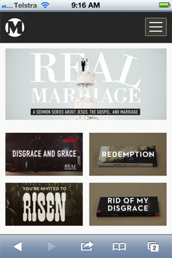
I have to confess I am a BIG fan of the team at Mars Hill Church. They have thought through their web strategy really well. Their branding is consistent. The pop up menu is super, although could be a little more obvious for the technophobes out there. The consistent use of the graphics and strong rectangular style almost has become a part of their brand style.
The blog style content strategy keeps the site feeling live and current.
Saddleback Church
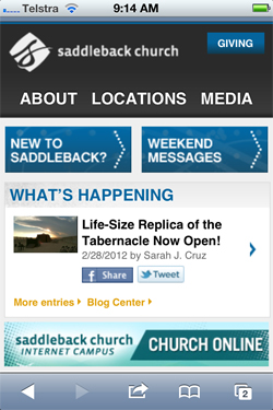
I’m a fan of words like “New to Saddleback” rather than “About Us” because I think that many people that visit churches out on mobile are actually people that have never been to church before. The language is less about the organisation and more about home the reader receives the words. So to have that front and centre is a great. I think the cross-promotion to the church online is a brilliant idea, if I was a prospective visitor I could get a sense of what the church
The Chapel
I remember seeing this site a few years ago and being very impressed with it. I still am.
Watermark Community Church
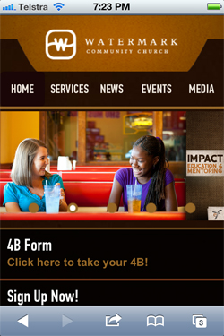
I’m a big fan of Watermark’s branding. Wherever I’ve seen it, either on their App or desktop web presence they are very consistent. It hasn’t been totally stripped back for mobile.
I like that their main navigation is above the fold and that it has people on it. I can feel like I connect with people.
I’m sure there are many more good quality mobile sites out there. If you were part of the team involved in the development of these sites. Good job! You are ahead of me, so a big hat tip to you 😉 For those of you that don’t know, check out the new App we just developed and give me your feedback.
Have you developed a mobile site for your church? Or what mobile site you like and why? Drop a comment below and share what you know.

